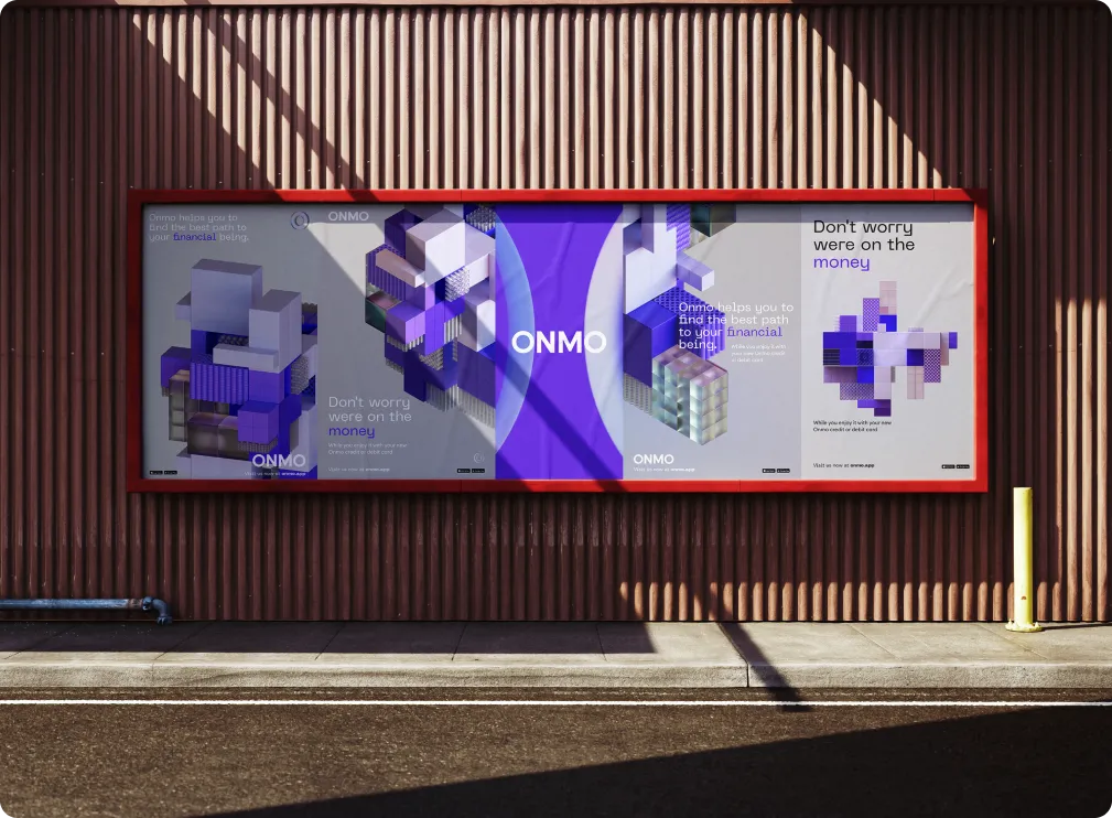
ONMO
I came in to help give Onmo a breath of new life after the initial branding didn’t fit the route they wanted to take. Working alongside their head of design, we quickly created four potential concepts and visual directions we could take the brand, eventually picking this route.
The clear O symbolises the transparency of the brand and makes it feel modern as well as approachable. Together we worked not just on the branding but also on the card design, web design, interactions and animations for the app.